
Mastering the Essentials of Excel Pivot Tables for Effective Data Analysis

In Microsoft Excel and other spreadsheet software, a pivot table is a potent data analysis and summarising tool that enables us to transform and analyze massive data sets, making it simpler to extract insightful knowledge and produce unique reports.
Features in Pivot Table
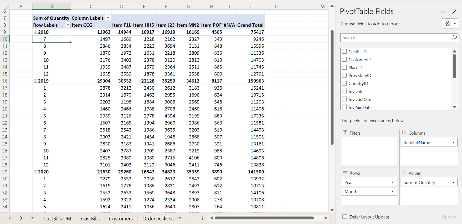
Here is an example of how to create a pivot table to show the monthly average quantity values for all the products over a three-year period.
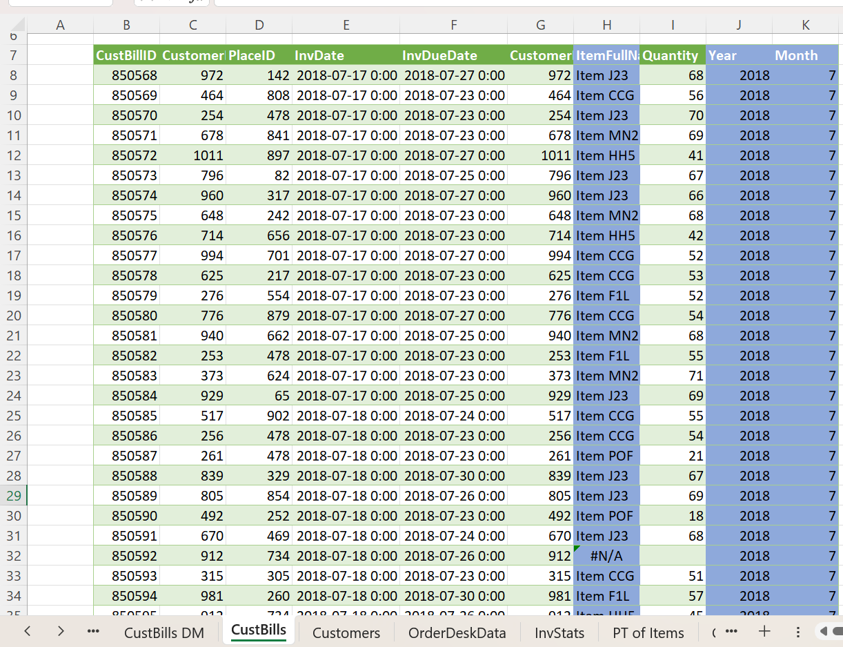
This is the data for which we are going to create a pivot table.
Step 1: Select the data, click Insert > select PivotTable > choose the location as a New Worksheet.
Step 2: From the Pivot Table Field, drag the ItemFullName into Columns, Quantity into Values, and Year and Month into the Rows field.
The Pivot Table will be displayed as shown below.
Drag and Drop Interface
Generating a Pivot Table is a straightforward process that doesn’t demand an in-depth understanding of Excel formulas. We can easily arrange and evaluate our data by dragging and dropping fields into distinct sections of the Pivot Table.
Dynamic Updating
If our source data undergoes modifications, we can update the Pivot Table, and it will promptly incorporate those adjustments, assuring that our analysis remains current at all times.
Data summarization
Pivot Tables help you summarize and consolidate large datasets by performing calculations such as sum, average, count, maximum, minimum, and more on numerical data.
In the above example where the sum quantity of items is taken into consideration, if we would like to calculate the count of quantity of items, then,
Go to Values field > Select the arrow in the Count of Quantity > Click Value Field Settings > Select Count.
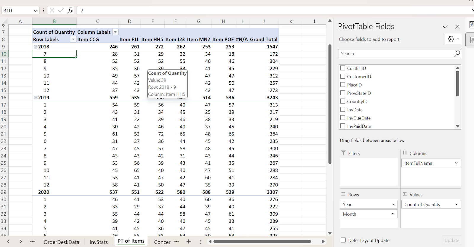
Likewise, we can also calculate the min, max, and average values of the data in a simple way without using complicated Excel formulas
Dynamic Filtering
Pivot Tables allow for interactive data filtering and analysis, enabling us to swiftly alter our data perspective by applying various filters. This simplifies the process of honing in on specific data aspects.
Filtering is done by dragging the field value that needs to be highlighted into the Filter column and modifying the options according to our needs.
Slicers
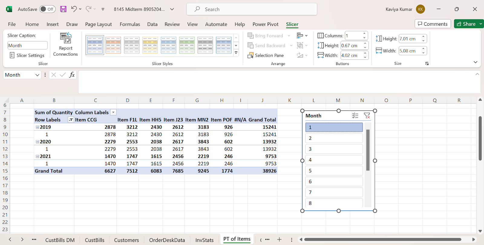
Slicers are interactive filtering tools that help us refine our data analysis. They provide a user-friendly way to filter data within a Pivot Table.
For example, if we want to display data of only the first month then we can use slicer filtering. Here are the steps to insert it.
Step 1: Click anywhere on the Pivot Table, select Insert > Slicer
Step 2: Choose Months from the drop-down list, the 12-month list will be seen, and then select 1 from Month to display the details of the first month.
The Pivot Table will look similar to this output.
Drill down
Drilling down helps to delve deeper into our data details, providing insight into the individual records that comprise a summarized value.
Visualization
We have the capability to merge Pivot Tables with Pivot Charts, resulting in the generation of visual data representations that facilitate the interpretation and presentation of our discoveries.
Pivot Charts can be created by: Selecting the Pivot Table > Click Insert > Select Pivot Chart > Choose the required chart.
Conclusion
Mastering Excel’s Pivot Table fundamentals is a crucial skill for effective data analysis, providing the ability to convert complex datasets into useful insights. This knowledge can improve decision-making and data-presenting skills, making it a valuable asset in a variety of contexts.
Start your journey to Pivot Table proficiency today!